


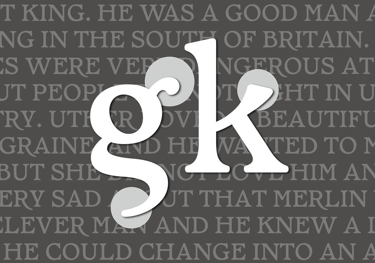


TYPE DESIGN
Pendragon, 2022
Regular and Italic, 155 Glyphs
TYPE DESIGN
Pendragon, 2022
Regular and Italic, 155 Glyphs
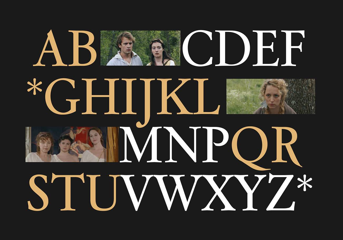
Pendragon is a display typeface with a regular and an italic version. Pendragon features a series of alternative glyphs and ligatures, typical of the medieval descendants of the Roman capitalis and the uncials.
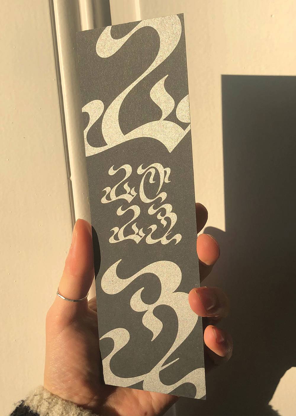

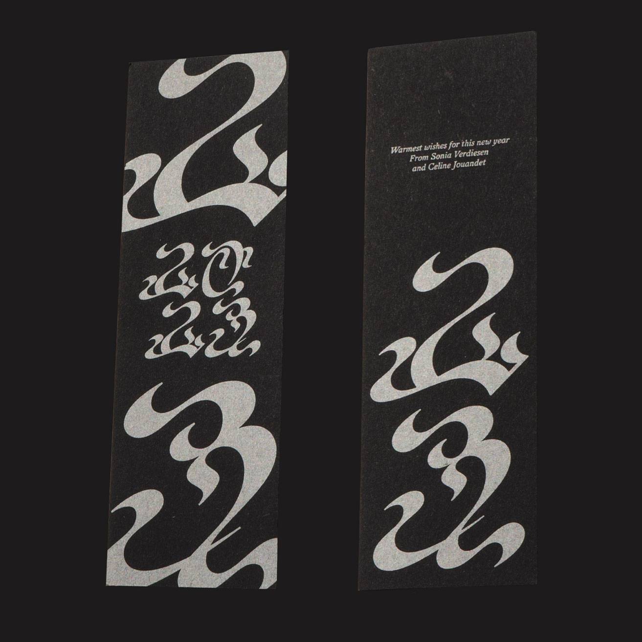

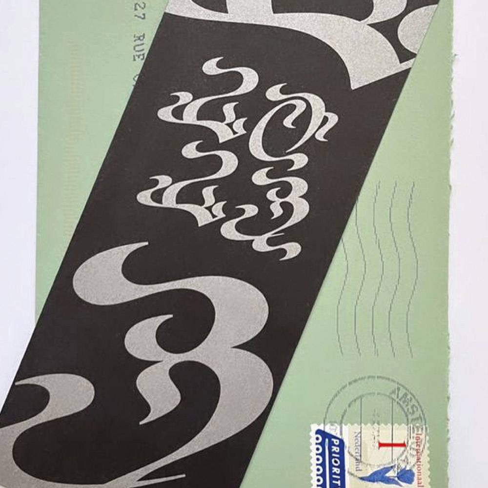
TYPE DESIGN AND PRINT
2023 Bookmarks, 2023
66 x 202 mm
TYPE DESIGN AND PRINT
2023 Bookmarks, 2023
66 x 202 mm
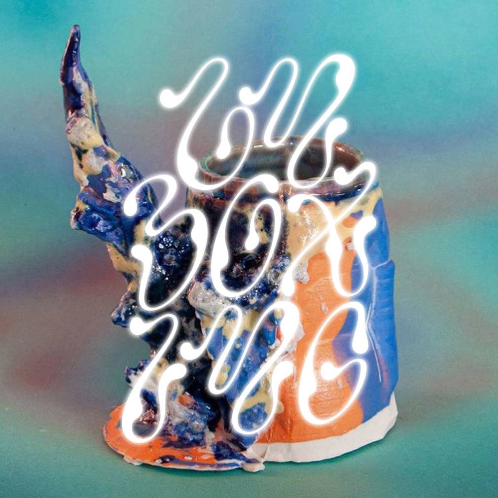
This project is a collaboration between Sonia Verdiesen and myself, and involves the creation of a unique typeface design for a New Year's card that can also be used as a bookmark. We created letters inspired by calligraphic tools and the beauty of flower stems and leaves.


IDENTITY, TYPOGRAPHY & PRINT
Unboxing, 2022
Exhibition Identity, Poster,
Lettering and Handout
IDENTITY, TYPOGRAPHY & PRINT
Unboxing, 2022
Exhibition Identity, Poster,
Lettering and Handout
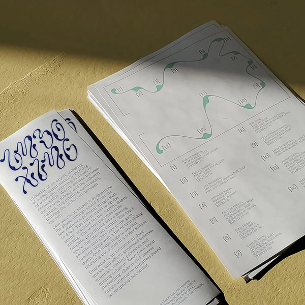
I was commissioned to design the visual identity for the Unboxing exhibition that took place in April 2022 at the Boo2 project space in Amsterdam. The project was initiated by Zuza Banasinska and Jeanne Vrastor, both former students of the Sandberg Institute, with the goal of uniting works around the theme of perception and navigation, under an original identity. To create the lettering, I drew inspiration from brown seaweed.

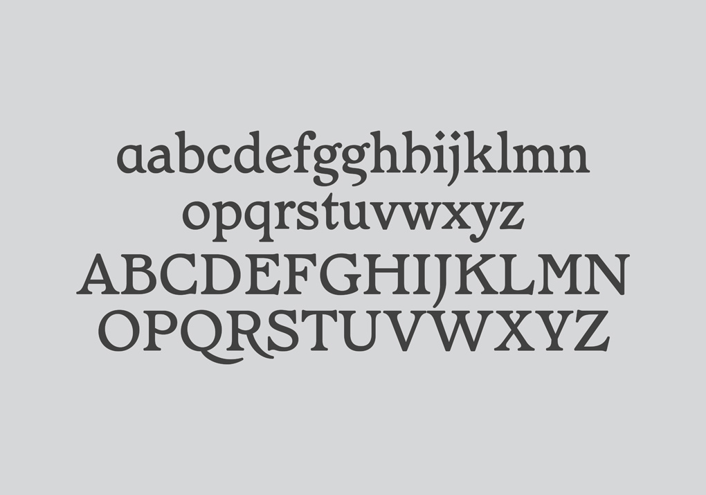
TYPE DESIGN
Maria Strick, 2023
Italic, 70 glyphs
work in progress with
www.productiontype.com
TYPE DESIGN
Maria Strick, 2023
work in progress with
www.productiontype.com
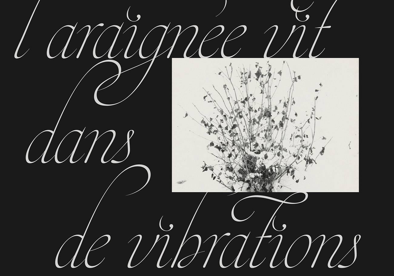
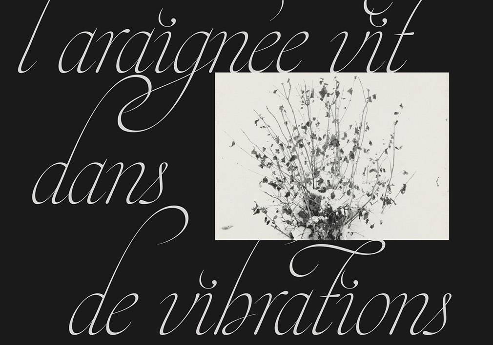
Maria Strick typeface draws inspiration from Flemish calligraphy, particularly Maria Strick's calligraphies. I started working on this font during my diploma project in 2021, which focused on arachnophobia. My aim was to showcase a different perspective on spiders, which are often associated with dirt and morbidity. Instead, I sought to demonstrate that the spider’s world, is actually airborne, sensitive, and sensory in nature.

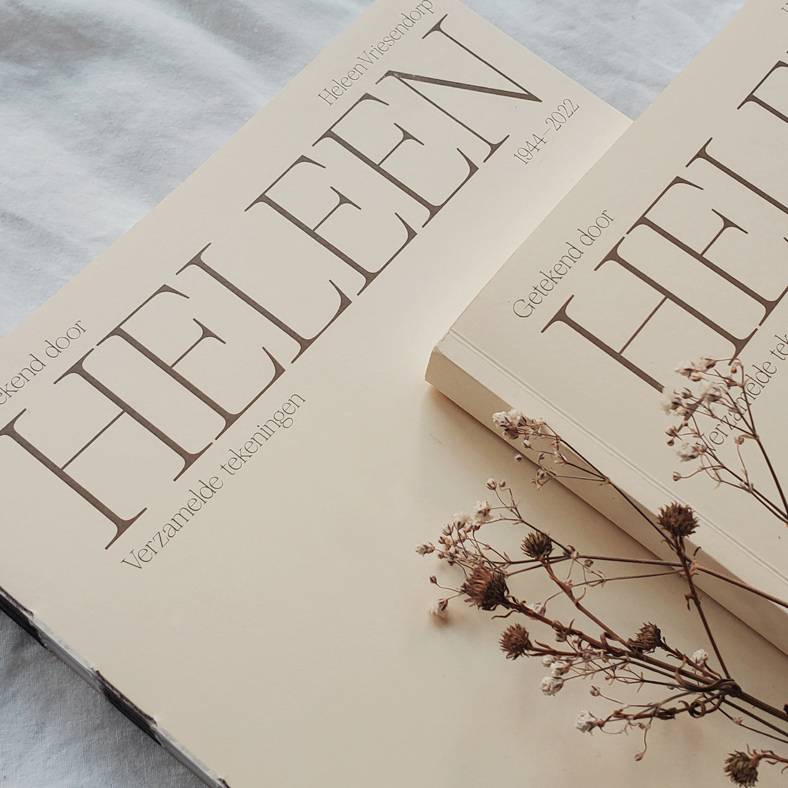
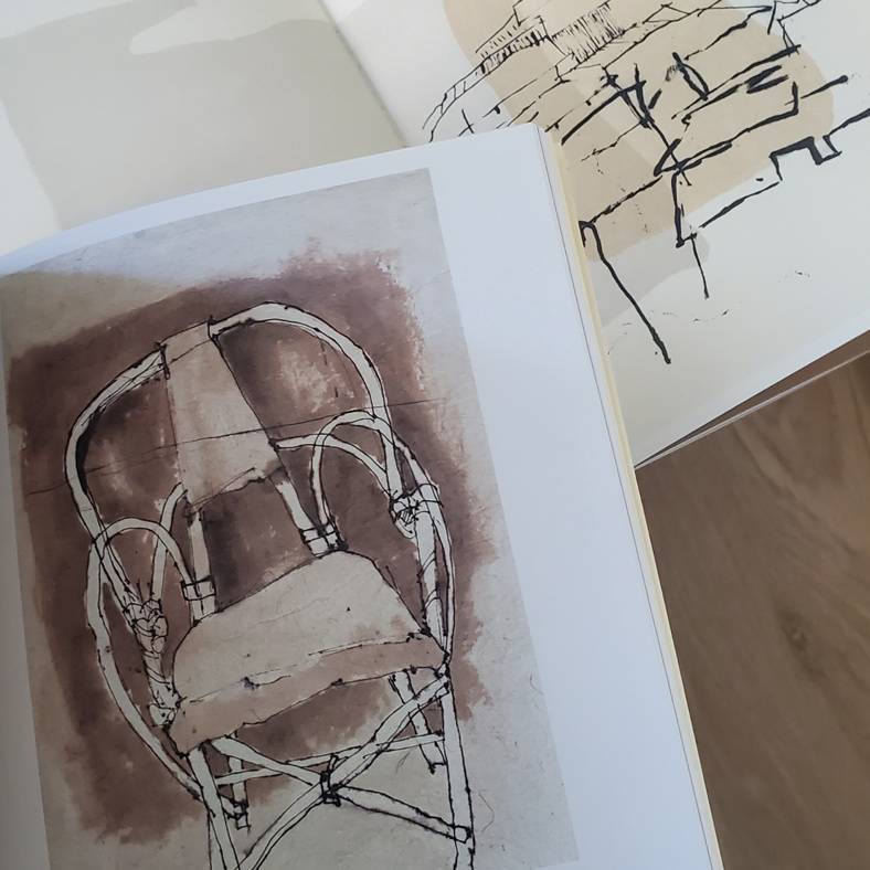


EDITORIAL DESIGN
Heleen, 2022
190 x 255 mm, 224 pages
EDITORIAL DESIGN
Heleen, 2022
190 x 255 mm, 224 pages
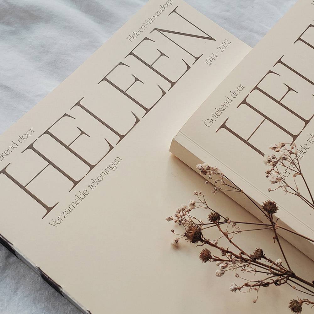
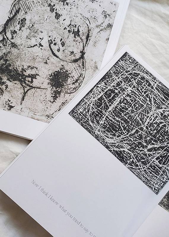
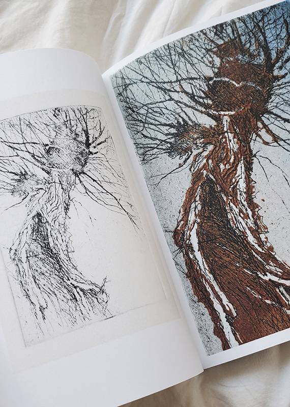
I completed an editorial design project for a book that showcases the paintings of Heleen Vriesendorp. The goal of the project was to create a sense of rhythm and a logical order for the paintings to tell Heleen’s story in a simple and natural layout. Together with Heleen, her family, printers, and binders, we successfully brought the project to life. The experience of collaborating with the artist allowed us to create a meaningful book that celebrates Heleen’s artwork in a thoughtful and understated manner.
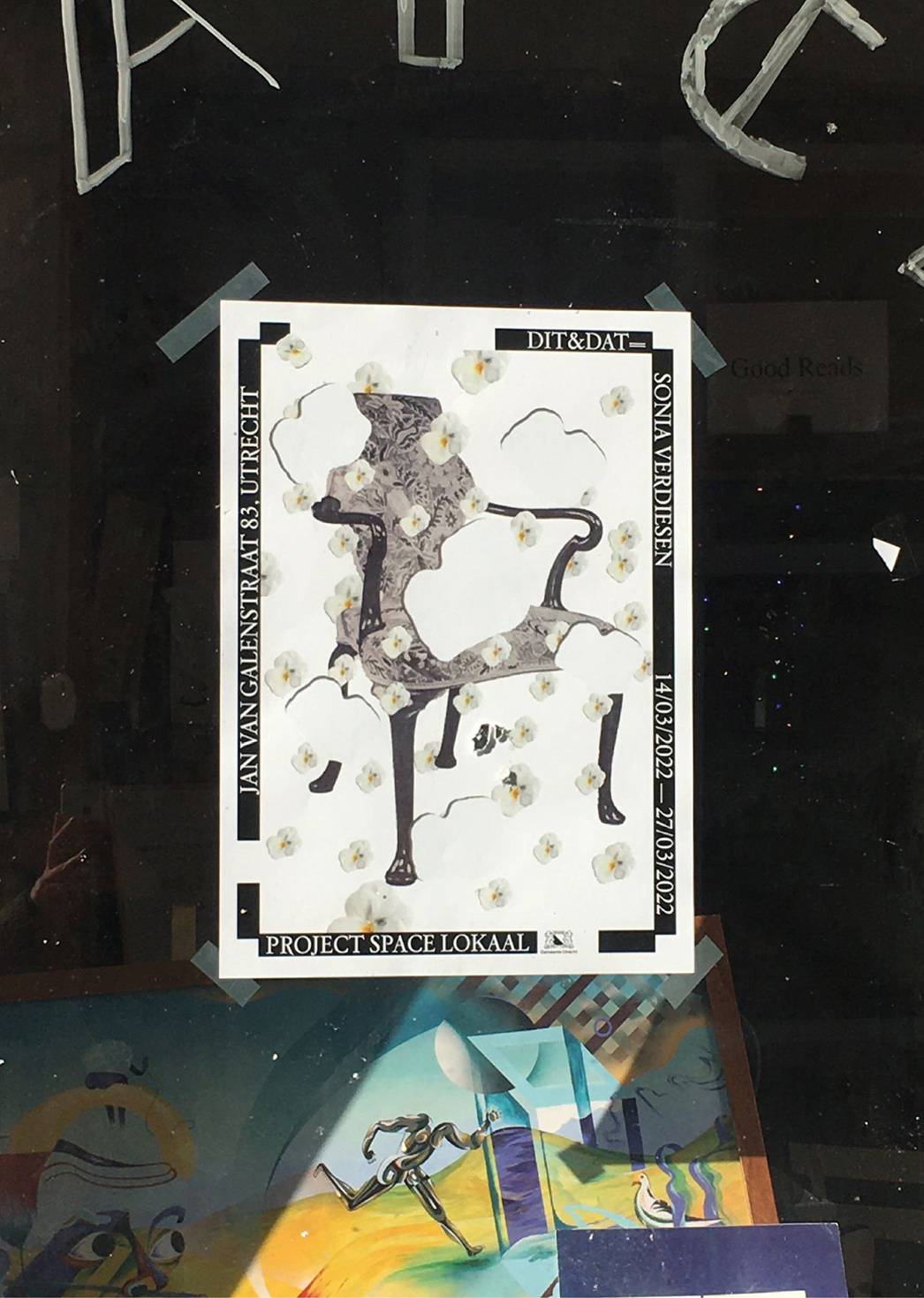
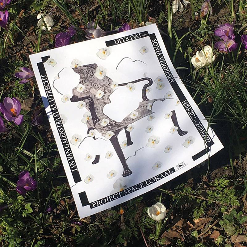


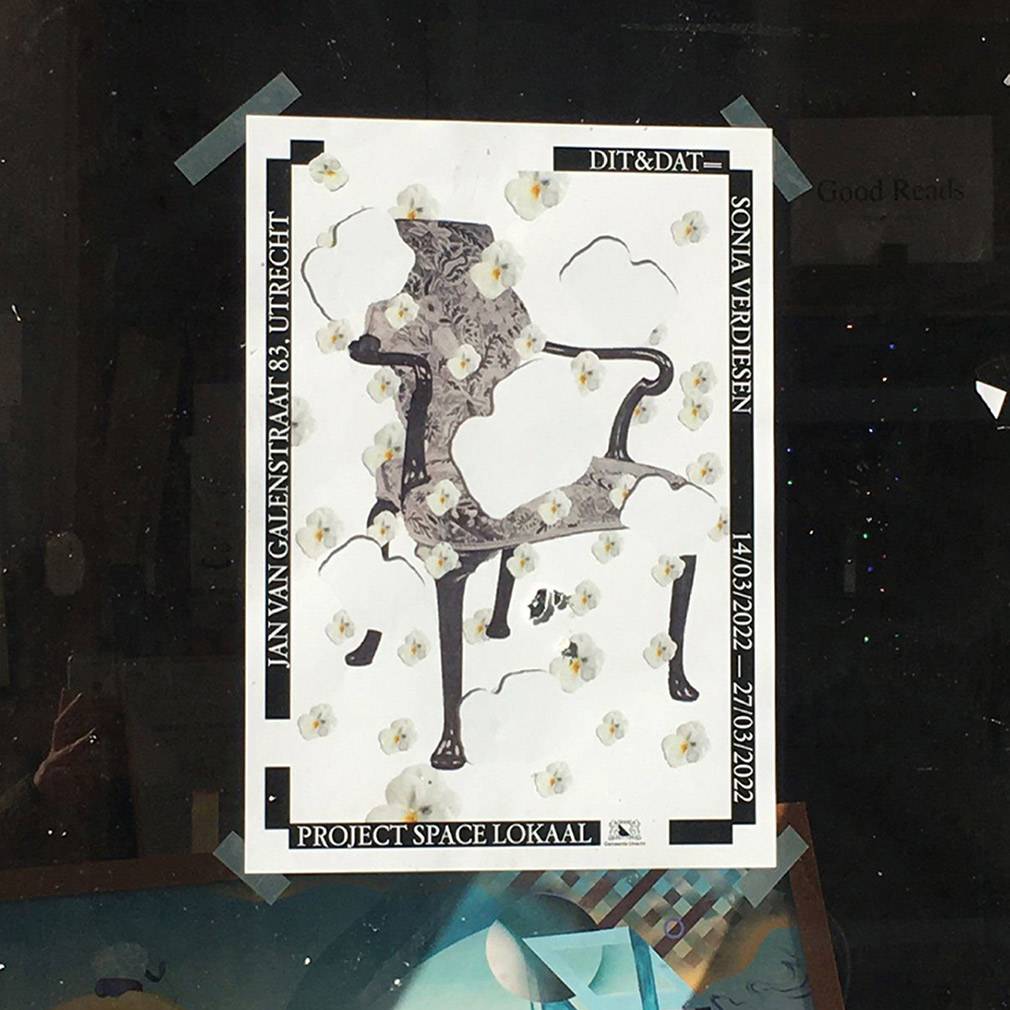
POSTER DESIGN, TYPOGRAPHY
Dit&Dat, 2022
Poster
POSTER DESIGN, TYPOGRAPHY
Dit&Dat, 2022
Poster
Sonia Verdiesen is a former photography student at the HKU. We made this poster together for her upcoming exhibition Dit & Dat at Project space Lokaal in Utrech. We chose my font Astraea to promote her installation. The Dit & Dat installation is an invitation to Sonia’s work and her research process. It questions her place as a woman, and the opposition between the ugly and the sublime.
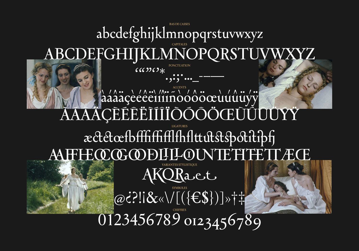

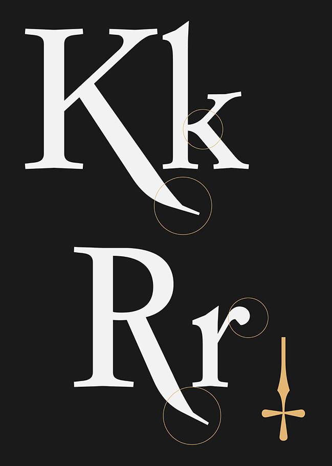


TYPE DESIGN
Astraea, 2021
Regular, 221 glyph
TYPE DESIGN
Astraea, 2021
Regular, 221 glyph
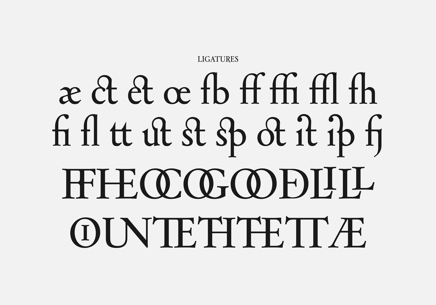
Astraea is a revival of Astrée by Robert Girard. For this revival, I wanted to be close to the historical inspiration of Garaldes and Elzevir, and also retake the name Astrée and it’s a universe that comes from Honoré d’Urfé’s book. My version of Astrée offers a variety of ligatures and special glyphs for stylistic uppercase. I also wanted to harmonise the specificities of lower and uppercase R.


EDITORIAL DESIGN & TYPE DESIGN
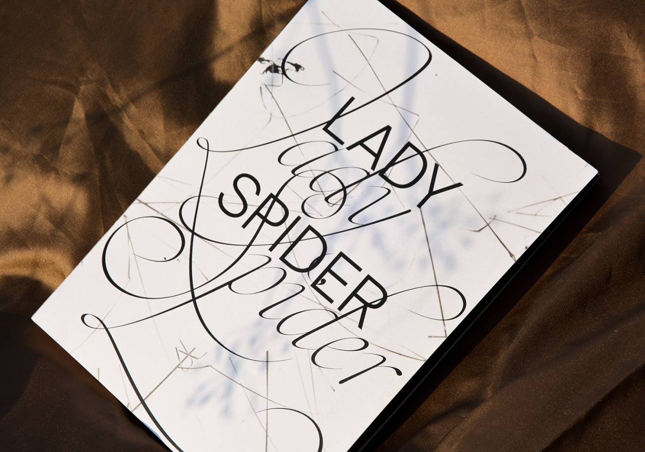
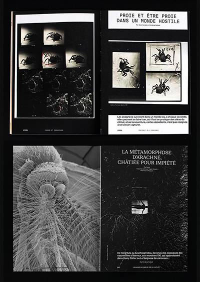
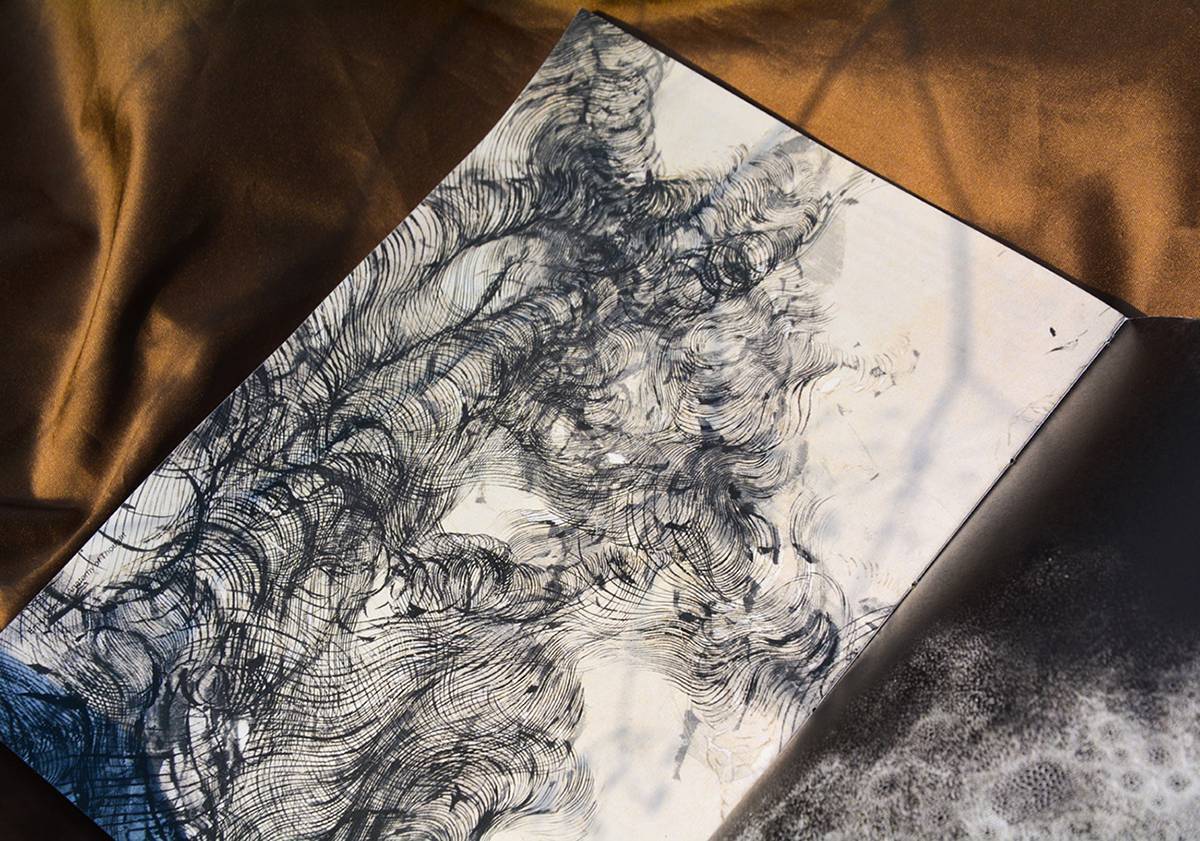
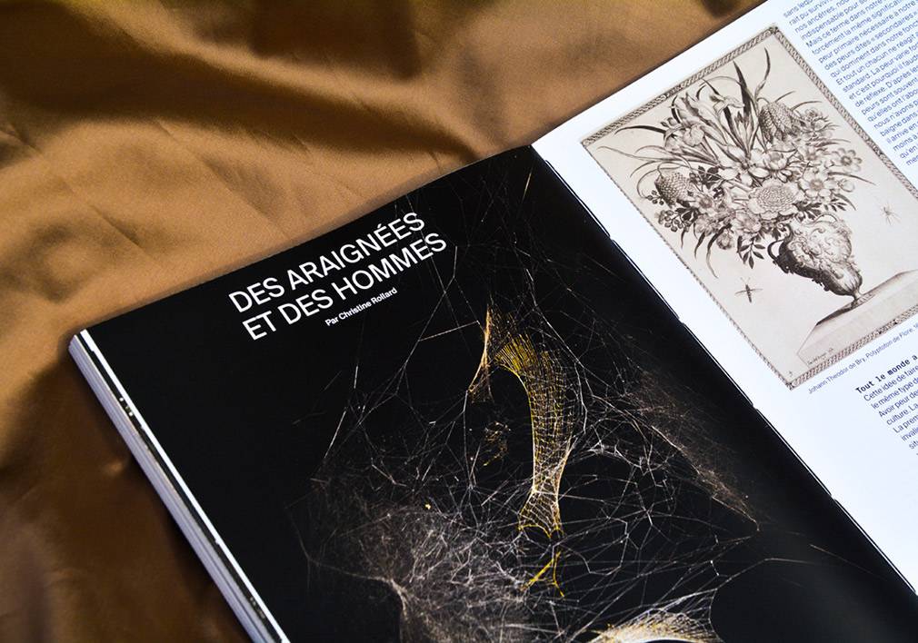
Lady Spider, Diploma Project 2021,
203 x 277 mm, 160 pages
EDITORIAL DESIGN & TYPE DESIGN
Lady Spider, Diploma Project 2021,
203 x 277 mm, 160 pages
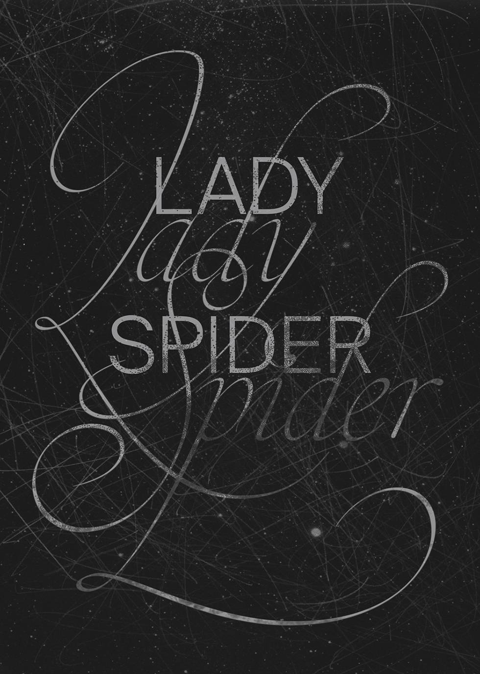
Measuring at an average of 5 cm, the spider is an everyday companion. Its appearance scares us: with its multiple eyes, its hairy body and its eight legs. Wrongly considered as a threat, it is not at all lethal for human beings. The objective of this project is to create a editorial and typographic supports to demystify the spider. To get out of an anthropocentric conception of the world. So to know so as not to fear.


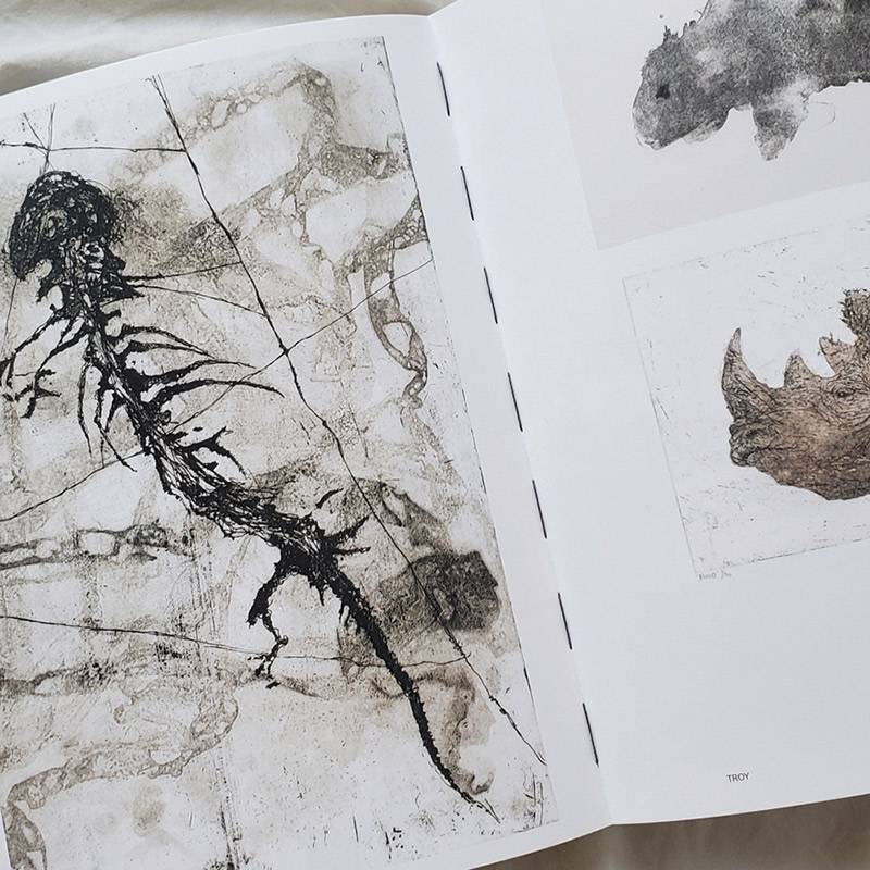
LETTERING
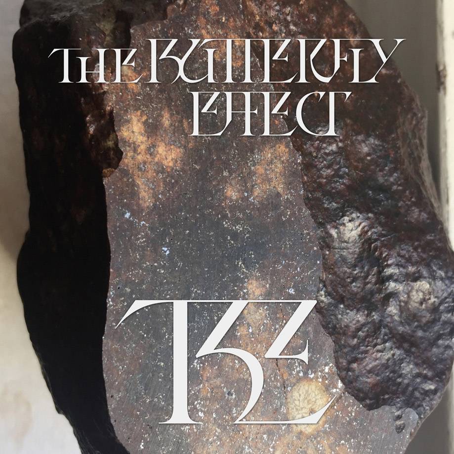
The Butterfly Effect,
2022 Lettering,
LETTERING
The Butterfly Effect,
2022 Lettering,
I was commissioned by Mathilde Renault to create lettering for her large-scale project, The Butterfly Effect, which is an interactive and immersive work that depicts the journey of a shooting star. Our goal was to create an epic lettering that blends science and poetry. In The Butterfly Effect, Mathilde Renault synthesizes planetary science, aerospace engineering, fragrance technology, and digital programming to map the journey of a former shooting star to Earth. Through light, sound, smell, and video, the 4.5-billion-year-old meteorite is presented in a multi-sensory installation that reveals its hidden genetics. The project was showcased at the 35th edition of the International Documentary Film Festival Amsterdam.
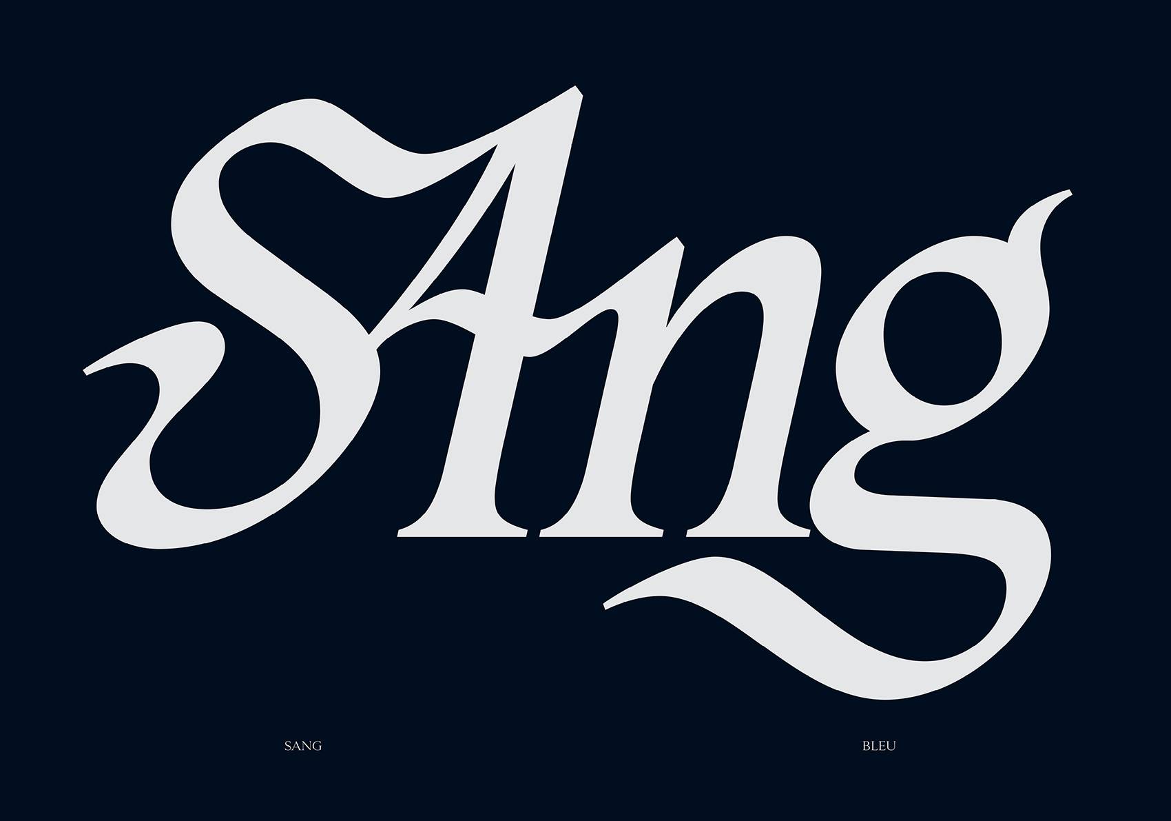


LETTERING
Sang, 2023,
For Les Typotos
LETTERING
Sang, 2023,
For Les Typotos
I created this lettering for a project in collaboration with Les Typotos. The theme was the color blue, and I chose to explore the expression "having blue blood." For this lettering. I wanted to experiment extensively with my calligraphy to achieve a flexible and impactful style.